No one likes a cluttered inbox.
Unfortunately, that is a reality most of us face daily. Promotional emails, work-related emails, personal emails, and more… After a while, they all seem to blur together.
So, how do you break through the clutter and stand out among all the noise?

Some 300+ Billion emails are sent each day worldwide. Dozens of emails flood many of our inboxes from companies or groups we’ve subscribed to, aka email marketing campaigns. But what makes some of these emails click-worthy and the others spammy? How do you get subscribers to open and, dare we hope, read your email instead of deleting it?
Here are 6 inspiring email marketing campaigns from the past few years. Together we will breakdown what they’ve done right and how you can implement those same strategies to start cultivating a loyal subscriber base and growing your business.
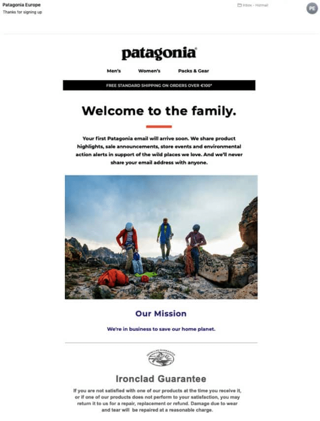
 Patagonia

This initial email is the first email you receive after signing up for Patagonia’s newsletter. While it may not seem all that special at first glance, this email does a great job of setting the expectations for the recipient, which is precisely what an email onboarding sequence should do. Right out of the gate, you have information about free shipping at the top, which is essentially an indication of how much money Patagonia hopes you will be spending on their website.
Furthermore, the headline is inviting. Patagonia goes on to tell readers the type of content they send (but they don’t mention frequency). They also provide the refund policy at the bottom of the email. It sets the expectations for their customers, which is a must for any ecommerce store.
While the intro email is a great time to set the tone for what matters most to your company, in this email Patagonia could have talked more about what makes the company unique. Just one or two sentences with a link or a button to their site, would have been great in place of the ‘Our Mission’ section.
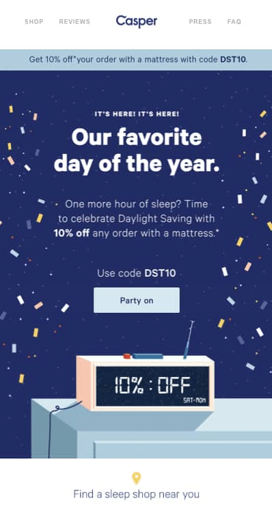
Casper

When an email campaign blends creativity, awareness, and value it’s a recipe for success. And in this example, Casper (distributors of the best night’s sleep) nails all three.
Blowout sales and random flash promos are overdone and ineffective–they are disconnected and make the customer feel more like a number rather than a part of your community. In this example, Casper does include a semi-discrete promo code and deal info. However, their main email message is oozing with creativity and awareness. Plus, who celebrates Daylight Savings? Exactly. In fact, most of us just end up sleeping in. And Casper knows it… they’re ok if you sleep in, just do it on a mattress you got from them. So subtle but very effective.
This email campaign is short, sweet, and every component is well designed and executed. There’s no really “fluff” or wasted space. If I were to change anything, I might adjust the discount percentage. I’ve followed Casper for some time now and most of their discounts are 10%. This could become empty noise over time. Otherwise, this is a perfect campaign.
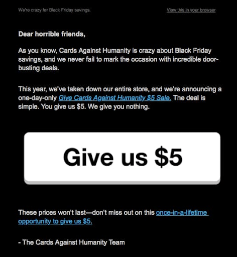
Cards Against Humanity

This campaign is a hilarious and ingenious Black Friday Campaign. If you are familiar with this slightly edgy card game, you can only expect their emails will be equally unpredictable, sarcastic, comedic, or cynical.
In addition to staying so perfectly on-brand, Cards Against Humanity delivers an unexpected and clever email suggesting that customers ought to pay them rather than offering any special deal for customers. For no good reason. They even make their donation request a completely unorthodox CTA button. Plus, what eCommerce store shuts down their store for Black Friday?!
While this campaign is truly unique and clever, the real brilliance is how they used it to tee up their follow-up email campaign. In the subsequent email, Cards Against Humanity disclosed their Black Friday Campaign’s success and, even more surprising, how they disbursed those funds for charitable purposes. They ended up receiving over $70,000 in response to their Black Friday Campaign! You can read all about it here.
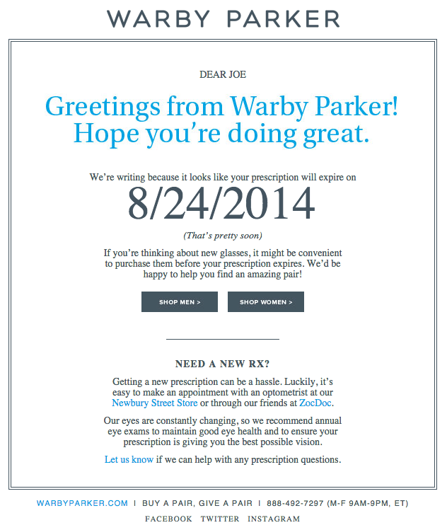
Warby Parker

In the eCommerce world, retaining customers, staying top-of-mind, and developing multi-purchase relationships are critical. There are several ways to achieve each of these; however, one effective way to do this is personalized email marketing campaigns. Personalized email campaigns can be as subtle and simple as only one word or as involved as an entire paragraph with graphics and all.
That said, Warby Parker’s refill update email is an excellent example of personalization. In this case, “Joe” has a prescription about to expire. In many situations, this would be a moment when a customer could easily slip away and forget about your brand. Warby Parker shows attention to timing, adds value to the customer, and even implies a bit of urgency. Who doesn’t appreciate a refill reminder?
Warby Parker’s reminder email may not be a designer’s dream, but it is personal, clear, and helpful. Plus, did you catch the clever co-marketing they pulled off with ZocDoc? Better yet, because of that one little sentence, now you have no excuse not to shop for new glasses from Warby Parker.
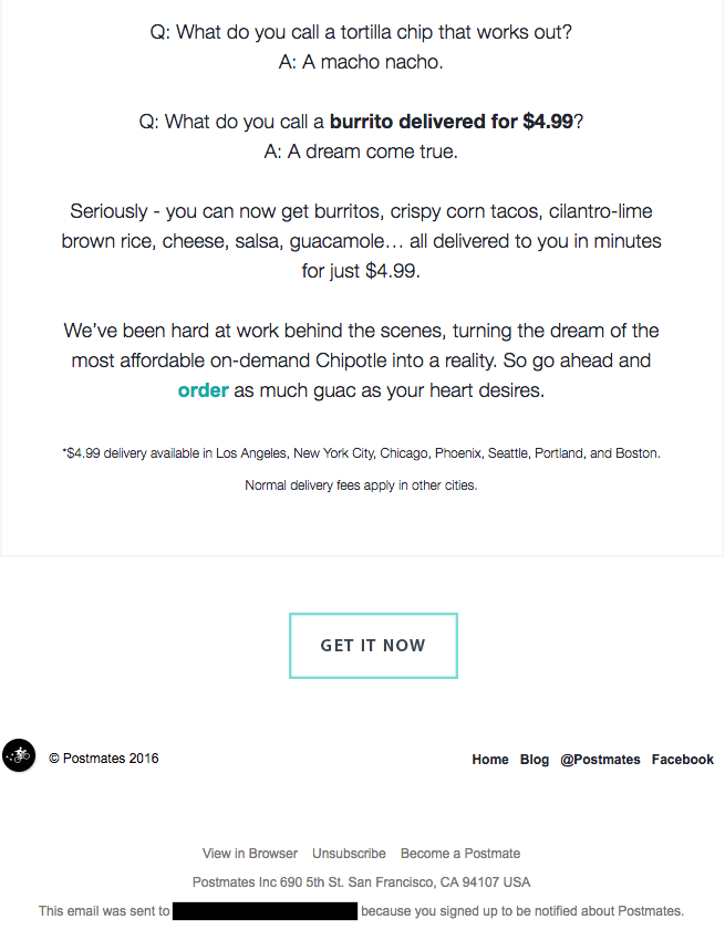
Postmates

Right off the bat, Postmates sets the tone with a fun and attractive GIF. This lets us know that they are an upbeat, modern, and playful brand. And, if you’re like me, it draws a pretty quick smile.
Continuing in that same spirit, their email copy is clever and playful. But, surprise, surprise, it’s also a sales pitch. This is one of the very few emails I’ve received that I forgot/didn’t realize I was being sold to and was more focused on how fun-loving and comedic it was.
Much like Warby Parker, Postmates delivers a short, clear, and enjoyable email without worry so much about frills and photos (other than that awesome GIF). The not-so-subtle CTA “Get It Now” is the only part I’m not so fond of. Something more in keeping with their tone, like “Yes Please!” or “Show Me Burritos,” would have been better.

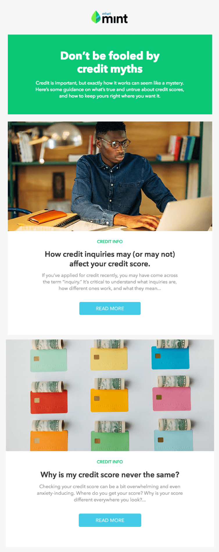
Mint

There’s no way around it, credit can be a scary topic. Which is a significant reason why this email’s headline catches your attention immediately. It makes you pause for a moment and question yourself: “What myths?”, “Are those myths fooling me?”, “How much do I actually understand credit?”.
Mint leverages color and space beautifully in this email. It’s clean, simple, and not overwhelming. The high-quality images, pops of calming color, and balanced layout are on brand and psychologically brilliant, reflecting the simplicity and helpfulness of the Mint application.
Overall, Mint hits it out of the park. Great design, compelling headline, urgency, proper use of color, helpful and value-adding, human/relatable, clear and concise message, subtle but targeted CTAs… they’ve done it all.